How to Create Graphics for Blender Add-Ons

When it comes to maximizing your Blender product sales, you can make a huge difference with a high quality product images.
That’s easy to accomplish when you are selling a photorealistic Lamborghini model.
But how do you showcase an add-on that doesn’t lend itself to stunning renders? Here are some tips and tricks for creating great graphics for technical add-ons.
Create a featured image for your product
So you’ve created this fantastic little add-on that will improve Blender workflow by 1200%, but how do you showcase it visually?
How do you decide what a featured graphic for your add-on should be?
Forget about beauty renders: let's build our new add-on some meaningful instead.
The Timeline Utilities add-on streamlines some of Blender's
operations. The add-on's image is clean, using simple shapes and a visual representation of a merged functionality.
Showcase the #1 benefit of your add-on
An image speaks louder than a 1,000 words - and you want it to send the right message.
Be crystal clear on what that is. Even if there are multiple benefits to your product, there will always be a number one reason why people choose it.
Your featured image should highlight this at first glance.
You don’t have to be original: “be clear, not clever” is always a good rule of thumb.
If the biggest benefit is saving time, your featured image should show that.

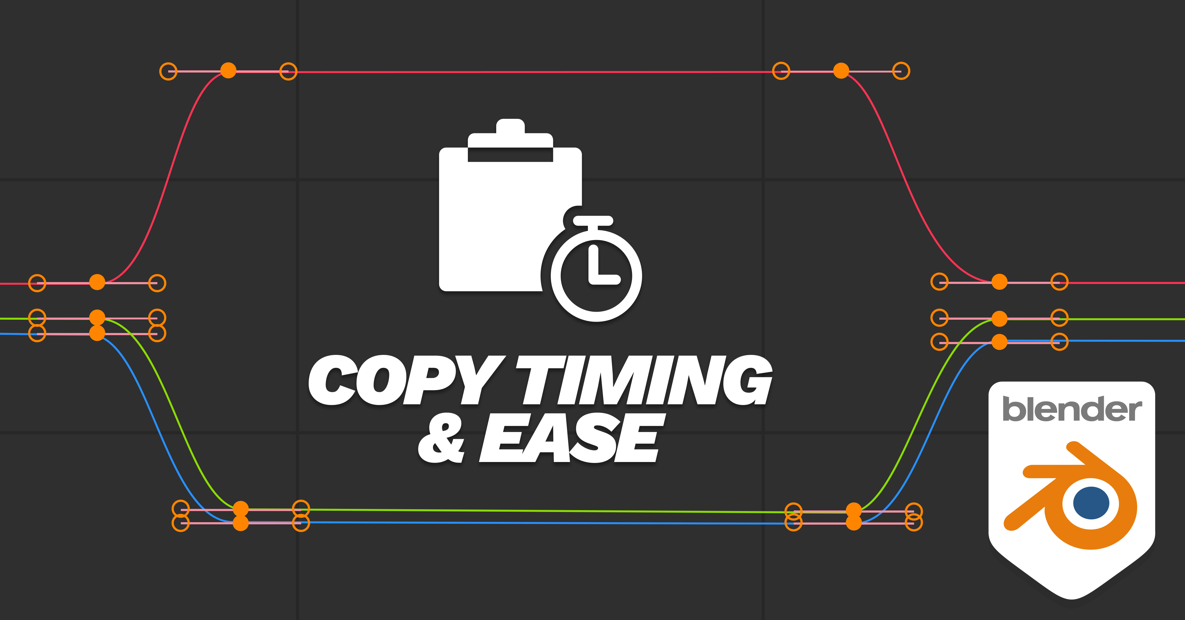
Copy Timing & Ease allows you to - surprise! - copy the timing and ease of an existing animation onto a new one.
The featured image uses an icon suggesting speed (clock), copy & pasting (notebook) and an F-curve.
Sure, a clock is not a groundbreaking graphic representation of time, but everyone will understand at first glance what your add-on is about.
If the biggest benefit is adding visual features of a Blender scene, your featured image should show the best user-case scenario.
For example, Scattershot is an add-on that scatters images procedurally on your render to avoid unnatural, regular scattering. Notice how Jonathan Lampel, the creator of Scattershot, used scattered cracks on his material to illustrate this.
Scattershot allows you to fully randomize textures. The featured image shows a close-up of a cracked-glass texture which is randomized to illustrate this functionality.
You can also add a simple phrase on your featured image.
Make sure it’s readable even in thumbnail size, so people can read it while browning the Blender Market product listing.Contrasting colors will help and a larger font size is a must in this case.Research other products on the Market
If you’re still unsure, a good starting point is a bit of old-fashioned snooping.
Don’t worry, we’re not talking industrial espionage…but you should be aware of what other creators are doing when it comes to featured and gallery images.
There is a huge number of well-thought-out, well styled and well branded products you can use as references when creating your own graphics.
Browse the bestsellers especially, since these have proven to be commercially successful and their product image will reflect this.
At the same time, you want your product image to stand out, so it shouldn’t be too similar to other, existing products. Use them for inspiration purposes only - then do your own thing.
Use good design to showcase your products features
Once you have the general idea, put your Graphic Designer hat on.
There are many good design resources online that can give you a quick overview of design principles you can use in your images.
Using things like visual weight, contrast, density and of course KISS can greatly improve your designs in a short amount of time.
Show the Before and After
Got your featured image?
It doesn’t end here: any product page will benefit from multiple graphics.
Showing a render “before” and “after” the use of your add-on always makes sense.
Adding text to your image also helps. Your page visitors may not read every single line of text on your page, but they are very likely to look at the images - which is hwy adding a few descriptors directly onto your images is a sure way to get them to read what you have to say about your product.
In this case, less is more: focus on the main benefits of your product.
____________________
Did you find this helpful? What other techniques do you use to make your product stand out visually? Let us know in the comments.